The Botanics
On Sunday, Emily, Adam and I went to The Botanic Gardens in Edinburgh. Emily needed headshots done for her portfolio and I badly needed a female presence in my own portfolio, so this was the perfect solution. I think we managed to get some amazing shots and that they are some of the best portraits I've done to date, owed much to Emily being so easy to photograph, The Botanic Gardens being such a nice place to take pictures and Adam always helping with ideas.
This first little area was lovely. The way the trees form an archway make it perfect for this type of shot, as do the the way the railings go all the way back, adding to the sense of depth. I also feel that both of these would be lesser shots without the bench being where it is. A trend throughout all these photos is the lovely contrast between Emily's skin tone and her black dress.
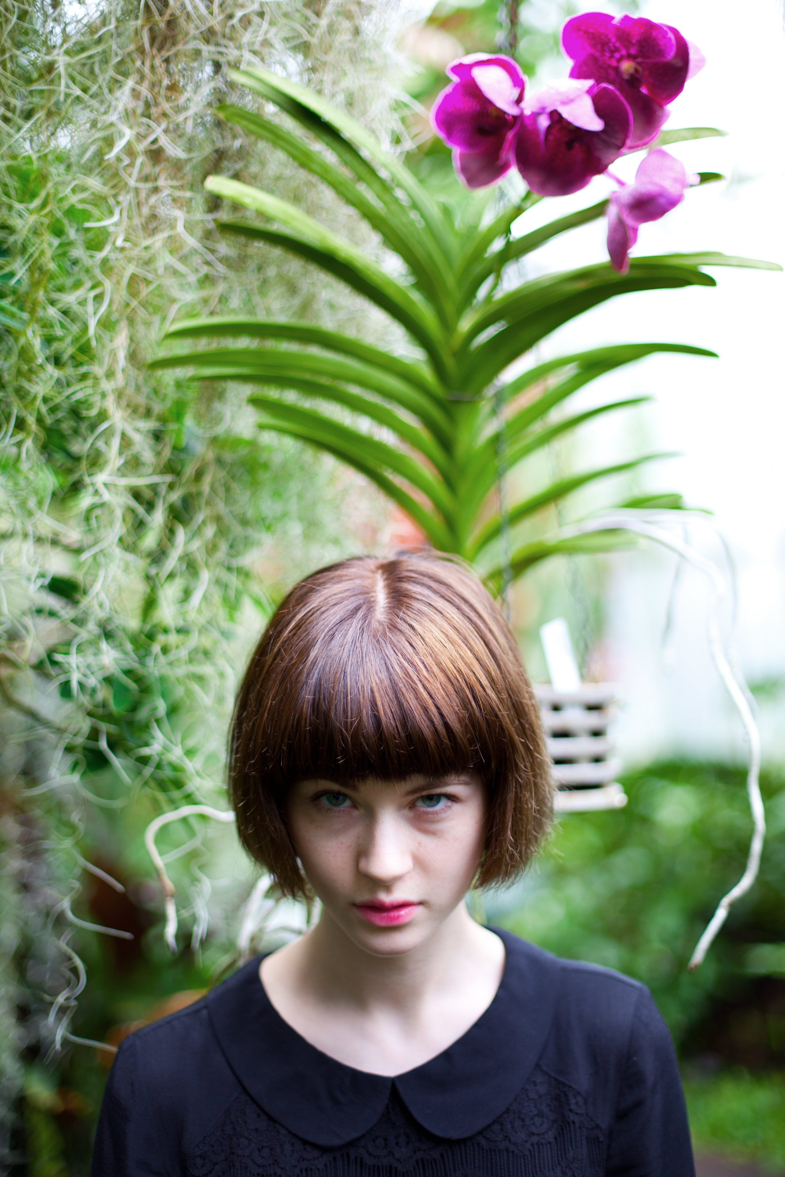
The following photograph might well be my favourite from the day. I absolutely love it. It required a slight bit of straightening and a tiny change to the contrast but that's it. It was basically perfect straight out the camera. It's almost like Emily is wearing an extravagant decoration in her hair. The natural light is lovely and the matching pink hues of the flower and Emily's lips really add to it.
My mind was set on taking portraits (and so were my camera settings) so I wasn't really aiming to take pictures of anything else, but as ever, you end up trying to grab a couple. I quite like how this picture of a little Koi(?) fish turned out. There was just something about the concentric circles made by the little guy that I found appealing. A fantastic photograph? Nah, but one that turned out quite well under the circumstances. Similar can be said for the photo after, not great, but I liked the way it's bushy tail looked.
Anyways that was your brief animal interlude, back to Emily! i tried a darker exposure to give this next one a different feel. I kinda like it, nice and moody.
All the photos of Emily so far made use of the natural look and colours rendered by the camera with only very minimal adjustments made, which was usually to the contrast or exposure. I love giving photos a certain look, but sometimes they just don't need it.
To keep things fresh, and because I felt the following three had more of an urban feel, I decided to go for a different look. I think (read: hope) that it works. The first two, specifically, are all about lines and how they cut through the frame. I'd never had the opportunity to take this kind of shot before so I'm extremely happy that they turned out as I had hoped they would. The third is a closer portrait and it was clear at the time that the lighting in that spot was beautiful. I kept the the same look for it since it was in the same setting and I feel like it, along with the other two, make for a very nice trio of images.
This final photo puts all the emphasis on Emily's face and as such is a much tighter crop. I went for muted tones and tried to focus on her eyes. It's little things like the very slight freckling on Emily's nose and cheeks that make the image. I've always been a fan of that type of up close and personal portrait, so I hope I've managed to pull it off.
Lastly, thanks to Emily for being a great model (you can see her page on the Model Team website by clicking here) and thanks to both Emily and Adam for a nice day out.


